
“Rounding” is a practice borrowed from healthcare leadership where administrators make regular, structured check-ins with their staff. Rather than waiting for annual surveys or hoping problems surface on their own, rounding gives school leaders a way to hear directly from teachers and support staff on a consistent basis. The questions are simple and intentional: what’s working, what do you need, how can leadership help, and who deserves recognition. Done well, rounding builds trust over time because staff see that someone is asking, listening, and acting.
The problem is that most schools doing rounding are either tracking it on paper, dumping it into a shared spreadsheet with no way to analyze patterns, or paying for a commercial platform that charges thousands of dollars per year. A colleague told me about a tool they saw presented at a conference that did exactly this, and the price tag was close to $5,000 annually. My first thought was “I bet I could build that.” So I did.
The Staff Rounding Dashboard is a free, open-source Google Apps Script tool that handles the full rounding workflow. Staff submit anonymous feedback through a clean web interface. Administrators can view raw response data, filter by school and time period, and generate AI-powered analysis reports that identify themes, surface resource needs, and suggest specific actions. Everything runs inside a Google Sheet that your district controls.
This tool is designed for building principals, district administrators, and anyone in a leadership role who wants a structured way to collect and act on staff feedback. It works well for individual schools and for districts managing multiple buildings. It is not a replacement for deep conversations, walk-throughs, or the relationship-building that effective leadership requires. It is a starting point, a way to make the asking and listening part more consistent and the pattern-finding part less manual.
A few honest constraints worth noting: the tool requires Google Workspace (which most schools already have), it requires a Claude API key for the AI analysis feature (which costs a small amount per report), and it is not as polished as commercial alternatives with dedicated support teams and mobile apps. What it gives you in return is full ownership of your data, zero vendor lock-in, and a total cost that is a fraction of what commercial tools charge.
Quick Look
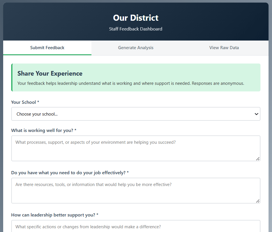
Staff see a simple, branded form. No login required, and responses are anonymous.
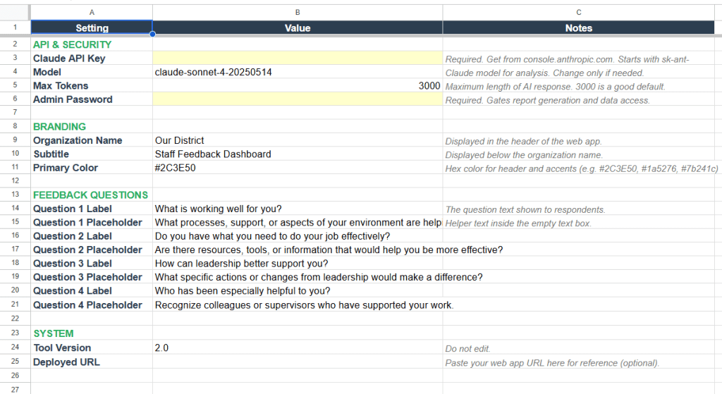
Everything from your organization’s name and colors to the questions themselves is configurable from the Config tab.
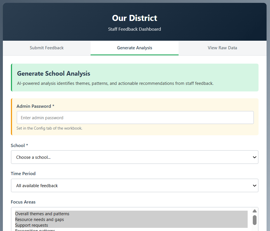
The AI analysis groups responses into themes, identifies patterns, and suggests specific actions with timelines.
Get Started
When you click “Make a Copy,” Google creates your own independent version of the entire workbook, including the script that powers the web app. The original template is not affected, and your copy is entirely yours to configure and deploy. No one else has access to your data unless you share it.
This copy is your starting point. The next section walks through everything you need to configure before sharing it with staff.
Setup Guide
The setup process has two phases: configuring the sheet (about 10 minutes) and deploying the web app (about 5 minutes). If you have set up a Google Apps Script web app before, you can probably skim the deployment steps. If you have not, do not worry. It looks more technical than it is, and I will walk through each screen.
Phase 1: Configure Your Sheet
Step 1: Open the Config tab. This is where all of your settings live. You will see three sections: API & Security, Branding, and Feedback Questions. Start at the top and work your way down.
Step 2: Add your Claude API Key. This is the one required step that involves an external service. You will need an Anthropic account and an API key, which you can get at console.anthropic.com. Paste the key into the Value column next to “Claude API Key.” The key starts with sk-ant- and is what allows the tool to generate AI analysis reports. Each report costs a small amount (typically a few cents, depending on the number of responses being analyzed). You can leave the Model and Max Tokens settings at their defaults.
Step 3: Set an Admin Password. This password controls access to the report generation and raw data tabs in the web app. Staff submitting feedback do not need it, but anyone who wants to run analysis reports or view response data does. Choose something your leadership team can share but that is not widely known. Type it into the Value column next to “Admin Password.”
Step 4: Add your branding. Set your Organization Name (this appears in the header of the web app), a Subtitle if you want one, and a Primary Color as a hex code. If you are not sure what hex code to use for your school colors, searching “hex color picker” will bring up tools where you can find the right value. The default dark blue (#2C3E50) works fine if you want to skip this for now.
Step 5: Review the feedback questions. The tool comes with four default questions that work well for general staff rounding. If you want to customize them, edit the Question Label and Question Placeholder fields. The labels are what staff see as the question text, and the placeholders are the helper text inside the empty text boxes. You can change these at any time, though keep in mind that changing questions after collecting responses means your earlier data was gathered under different prompts.
At this point, your Config tab should have an API key, an admin password, your organization’s name, and questions you are happy with.
Step 6: Set up your schools. Go to the Schools tab. You will see three sample rows. Replace them with your actual buildings. Each school needs a School ID (a short code like “LINCOLN_ES” or “CENTRAL_MS”), a School Name (the full display name), and the Active column set to TRUE. The Contact Email and Notes columns are optional and for your own reference. They are not displayed in the web app. Add one row per building. If you are not ready to include a school yet, set its Active column to FALSE and it will not appear in the dropdown.
Phase 2: Deploy the Web App
Step 7: Open the script editor. Go to Extensions > Apps Script. This opens the code that powers the web app. You do not need to change anything here. The code is already attached to your copy of the sheet.
Step 8: Run the preflight check (optional but recommended). In the script editor, select runPreflight from the function dropdown at the top and click the Run button. The first time you run anything, Google will ask you to authorize the script. You will see a screen that says “This app isn’t verified,” which looks alarming but is normal for any Apps Script project that has not gone through Google’s formal review process. Click “Advanced,” then “Go to Staff Rounding Dashboard (unsafe),” then “Allow.” The preflight function checks that all your tabs are present and your required settings are filled in. Look at the execution log (View > Execution log) to see the results.
At this point, you should see a list of OK and INFO lines confirming your tabs, API key, admin password, and school count.
Step 9: Deploy. In the script editor, click Deploy > New deployment. Under “Select type,” choose Web app. Set “Execute as” to “Me” and “Who has access” to “Anyone.” Click Deploy. Google will give you a URL. This is the link you share with staff.
Step 10: Test it. Open the URL in a new browser tab. You should see your organization’s name in the header, your brand color, and your schools in the dropdown. Submit a test response to make sure it writes to the Responses tab in your sheet. Then switch to the Generate Analysis tab, enter your admin password, select the school, and generate a report to confirm the AI analysis works.
If the web app loads but the school dropdown is empty, check that at least one school in the Schools tab has Active set to TRUE. If the AI report fails, verify that your Claude API Key is pasted correctly in the Config tab and that your Anthropic account has available credits.
Make It Yours
Once the tool is running, there are a few areas worth exploring as you get comfortable with it.
Questions are the most natural thing to customize. The defaults cover the basics of rounding, but your context might call for different emphasis. Some leaders swap the fourth question for something about professional development needs. Others adjust the wording to match language their staff already use. Just edit the labels and placeholders in the Config tab, and the web app picks up the changes automatically.
The analysis focus areas shape what the AI report emphasizes. When generating a report, you can select from several focus areas (overall themes, resource needs, support requests, recognition patterns, professional growth, leadership actions) and add your own context notes. If your school is in the middle of a curriculum adoption, for example, you can mention that in the Additional Context field, and the analysis will weigh responses with that lens.
Date range filtering helps you track change over time. Rather than always analyzing everything, try running reports for the last 30 or 90 days and comparing them to earlier periods. Patterns in what staff are asking for, and what they stop asking for, can tell you a lot about whether your actions are landing.
The raw data tab and CSV export are there for when you need to go deeper. The AI report is useful for identifying themes quickly, but sometimes you need to sit with individual responses. The data tab lets you view and download everything for a given school and time period.
If you want to go further with the script itself, the code is organized into clearly labeled sections and commented throughout. The most common modifications would be adding additional feedback questions (which requires changes to both the form and the response logging) or adjusting the AI analysis prompt to match your district’s priorities. That said, the tool works well as-is for most rounding use cases, and getting comfortable with the basics before modifying the code is the better path.
Connect and Continue
This tool started because someone described a $5,000 problem and I thought it was worth trying to solve it for free. It is not perfect, and it is not trying to compete with commercial platforms that have full-time development teams behind them. What it does offer is a straightforward, district-controlled way to start or improve a staff rounding practice without a significant financial commitment.
If you run into issues during setup, have ideas for improvements, or just want to share how you are using it, I would love to hear from you. Reach out at licht.education@gmail.com or find more tools and articles at bradylicht.com.
Staff Rounding Dashboard v2.0. Distributed under CC BY 4.0.
