

v1.6 (7/11/25)
Introduction
Created at BHSSC under CC BT NC-SA. While intended for BHSSC employees, multiple external partners have asked for an easy way to access and share this design system. As such, the system has been copied here for convenience and has been left under its original creative commons license. This means that you are free to share, modify, and use this design system with attribution for non-commercial purposes.
You can also download the original Canvas Course Export Package here.
How To Start Using
- Download the original Export Package and load it into your course shell. You can also copy items directly from the design system and template items throughout this page.
- Review template – After loading in, take the time to review the instructor info module and check the template version.
- Fill in essential blanks – Adjust the text and bracketed items on the home page, overview, and instructor contact info pages.
- Be careful when adjusting the home page of the course; It is recommended that you do not touch the buttons along the bottom of the home page.
- Feel free to change the banner at the top of the course as needed.
- Add content – Add modules and course elements (pages, quizzes, assignments, etc) as desired.
- Use premade parts – Take advantage of optional icons, components, graphics, and more within this template by copying items as needed. This template approach is based on Atomic Design; as such, smaller, combinable pieces are emphasized over full-page constructions.
- Check it against the evaluation criteria (for BHSSC employees) – Your course should meet the “required” items before being published.
- Publish & Post (for BHSSC employees) – If you’d like your course to be added to the Instructure Catalog, reach out to the Canvas Root Admin to coordinate the listing.
Guiding Principles
- Simplicity is elegant.
- “Simplicity means the achievement of maximum effect with minimum means.” – Dr. Koichi Kowana
- Make it mobile-friendly and accessible.
- Test with the smallest phone settings, on low-internet access, and with screen readers.
- Make it clear and concise.
- Buttons, assignments, and page names should never make someone “think.” Call it what it is.
- If a page is longer than your screen+half, make a change.
- Save yourself time.
- If you find yourself thinking “There must be a better/quicker way” when designing a course, there probably is.
- The first goal of any LMS should be to save you time: automated quizzes, collecting handouts, and more.
- Design with intent.
- Make templates your own; every context and audience has unique needs.
- Adapt, remix, or toss, but always be ready to justify your design decisions.
Design System
This design system is structured into three tiers of basic building blocks, components, and templates. For the sake of flexibility, basic building blocks are not specified and each component and full page template should be adjusted accordingly. It is recommended that defaults are not changed within Canvas when possible to make it easy for instructors to adopt.

Quick Components
Click here to see all quick components. Quick components are snippets of pre-formatted/made items that you can pull into any page or RCE. The goal of the quick components is to both save time and expand what is possible within Canvas for every instructor. More advanced ones should be used selectively. Try to be intentional with them and to keep complexity to a minimum.
NOTE: In the downloadable export package, quick components will be in a slightly different order but will still be fully available.
Quick Components – Icons
This downloadable template is pre-loaded with a selection of course icon images. These icons can be used to quickly help add visual flair and organize content. These icons can be added using the Rich Content Editor (RCE). The icons can be found under files by navigating to the template-images (folder) and then icons (subfolder). After adding these icons to the page, consider marking them as decorative. If you do not mark them as decorative, ensure that you have added alternative text describing the icon and/or what it represents. Click here to explore In-Page Icons, an atomic element that is used throughout various components.
How do I use these icons?
These icons can be used to quickly help add visual flair and organize content. They are all marked as decorative images, meaning they will not show on low internet access and will not interfere with screen readers. It is recommended that they are always paired with appropriate text for this reason. If paired as part of a section header, it is recommended that they are placed before the text itself.
Any time you are using the Canvas Rich Content Editor, you will have easy access to these icons. They can be selected from the “insert” option or the Icon Maker item on the top bar.
These icons will be included as part of your “Saved Icon Maker Icons.”
After adding these icons to the page, consider marking them as decorative. If you do not mark them as decorative, ensure that you have added alternative text describing the icon and/or what it representsLinks to an external site..
Example of Use
While icons could be used in many ways, the most common is as extra visual flair for section headers.
Content Icons

 Watch
Watch
This could be used for but is not limited to the following:
- Embedded videos

 Read
Read
This could be used for but is not limited to the following:
- Articles
- Assigned reading from a book

 Explore
This could be used for but is not limited to the following:
- Collections of various materials
- Simulations
- Slide decks
- Web searches & independent research
Activity Icons

 Experiment
This could be used for but is not limited to the following:
- Open-ended encouragement to try something
- Applications of learning
- Action research

 Write
Write
This could be used for but is not limited to the following:
- Short essays
- Journals
- Written reflections

 Create
This could be used for but is not limited to the following:
- Open-ended projects
- Visual demonstrations of learning

 Think
Think
This could be used for but is not limited to the following:
- Reflections
- Brainstorming
- Points to ponder

 Discuss
This could be used for but is not limited to the following:
- Discussions
- Presentation tasks
- Encouragement to discuss elsewhere or with peers
Other Icons

 Target
This could be used for but is not limited to the following:
- Learning Goals
- Outcomes
- Success Criteria

 Keep
Keep
This could be used for but is not limited to the following:
- Downloadables
- Resources
- Encouragement to remember something for later

 Idea
Idea
This could be used for but is not limited to the following:
- Key points
- Quotes
- Module Summaries

 Check
Check
This could be used for but is not limited to the following:
- Self-assessments
- Check for understanding
- Quizzes
- Surveys
Quick Components – Pre-Written Text
To use a pre-written text quick component, copy and paste the text into any page or RCE. Within the text, several items are highlighted a light blue. Any light blue highlighted sections should be changed by you when copying the snippet over. After changing the sections, remove the light blue highlighting. The items below were selected for the frequency of use along with their instructional value. Click here to see level 1 components.
Outcomes & Success Criteria
Outcomes and Success Criteria can be placed at the top of each page to help orient and provide clarity to the participant. In this instance, an outcome can be considered a course-level goal while success criteria provide a specific sub-goal for a page. Any rubrics used for end-of-module or mid-module assessments can be directly built from the success criteria listed. Using consistent color codes for the different goals can help participants easily distinguish between the goal levels.
Text Snippet
- Outcome: “[outcome]“
- Success Criteria:
- “[insert success criteria]“
Supporting Research
Hattie (2008) found that clarifying learning intentions and success criteria has an effect size of 0.75, indicating it has a significant impact on student achievement. Providing clear outcomes and success criteria helps students understand what is expected of them and take ownership of their learning (Wiliam, 2011). Breaking down learning goals into specific, measurable success criteria allows for better self-assessment and targeted feedback (Sadler, 1989).
Immersive Reader Reminder
The Immersive Reader is a powerful tool from Microsoft that allows text to be read aloud, contrast to be adjusted, and enables other accessibility features. This is embedded into Canvas when enabled by the Canvas admin. However, this feature is not well-known by participants. As such, placing a reminder at the beginning of a long piece of text or content can help participants remember that the feature exists. Using a small microphone icon is preferred over an emoji as it can be marked as decorative for those using screen readers.
Text Snippet
Read the passage below. You can also use the immersive reader to have it read aloud.
Supporting Research
Providing reminders about accessibility tools like the Immersive Reader can significantly improve their adoption and use by students with disabilities. Research shows that many students are unaware of available accessibility supports, with one study finding only 22% of students who could benefit were using text-to-speech tools (Ğvercină & Faltinşen, 2019). Embedding reminders directly in relevant course content increases the visibility and perceived value of such tools (Rao et al., 2018). Using an icon cue like a microphone effectively and concisely draws attention, especially when combined with clear instructional text (Petrie et al., 2005). Enabling all students to easily access read-aloud functionality and other accommodations promotes an inclusive learning environment aligned with Universal Design for Learning principles (Al-Azawei et al., 2016).
Square, Circle, Triangle Prompt
Square, Circle, TriangleLinks to an external site. is a simple prompt that can be used to encourage individuals to align things with their prior understandingLinks to an external site., use inquiry, and summarizeLinks to an external site.. This is a powerful and flexible framework for discussions or assignments.
Text Snippet
For [topic, chapter, video, etc], answer the following prompts in the medium of your choosing.
- Square – What squared with your understanding? What made sense to you? What do you agree with?
- Circle – What is circling around in your head? What questions do you still have?
- Triangle – What are three points that you would like to remember?
[turn in instructions such as “You do not need to turn in your answers. However, we encourage you to save them for future reference.]
Supporting Research
According to Marzano (2007), summarizing and note taking have an effect size of 1.00, indicating a very high impact on student learning. The Square, Circle, Triangle framework incorporates elements of both summarizing key points and identifying areas for further inquiry. Activating prior knowledge, as prompted by the “Square” question, is another high-yield strategy with an effect size of 0.93 (Dean et al., 2012). Encouraging self-questioning, as seen in the “Circle” prompt, promotes metacognition and deeper engagement with the content (Darling-Hammond et al., 2008).
Show, Slow, Grow Prompt
Show, Slow, Grow is a simple framework for demonstrating learning and reflecting on progress in a way that is allows the flexibility and autonomy often sought by adult learners. This is adapted from Stashek and PerrineLinks to an external site..
Text Snippet
Based on what you have learned recently, answer the following prompts in the medium of your choosing.
- Show – Select one or more pieces of evidence that show what you have learned. You can select from tasks, personal reflections, or notes. You can also create something new if you feel that you do not have enough evidence of learning.
- Slow – Reflect on your learning. Did you learn what you intended to? When helped your learning? What hindered your learning?
- Grow – Based on your experience, what would you like to learn more about? What strategies or resources could help you with that?
[turn in instructions such as “You do not need to turn in your answers. However, we encourage you to save them for future reference.]
Supporting Research
Self-assessment and reflection are key components of self-regulated learning, which has been shown to improve academic performance (Zimmerman, 2002). The Show, Slow, Grow framework provides a structured approach to reflecting on learning and setting goals for future growth. Hattie (2008) found that self-reported grades, a form of self-assessment, have an effect size of 1.33, indicating a very high impact on achievement. Additionally, adult learning theory emphasizes the importance of autonomy and self-direction in learning (Knowles, 1984), which this prompt supports by allowing learners to choose their evidence of learning and areas for growth.
Explore & Ponder Prompt
Explore and ponder is a table-based prompt to provide participants with a large amount of content and pair it with items to ponder. While a common component of Canvas courses, additional caution is needed. It is easy to accidentally resize tables or structure them in a way that is not accessible or mobile-friendly. As such, this could be considered a pepper-and-a-half rating. Use this component sparingly.
Text Snippet
| Explore | Ponder |
|---|---|
| [add content] | [add prompts] |
| [add content] | [add prompts] |
| [add content] | [add prompts] |
Supporting Research
The Explore & Ponder prompt combines content delivery with reflective questioning, two strategies with strong research support. Hattie (2008) found that organizing and transforming information has an effect size of 0.85, suggesting that presenting content in a structured format like a table can enhance learning. Reflection and metacognitive strategies, as encouraged by the “Ponder” prompts, have an effect size of 0.69 (Hattie, 2008). However, it’s important to note that cognitive load theory cautions against presenting too much information at once (Sweller, 1988), so the amount of content in the “Explore” column should be carefully considered. Additionally, the table format may present accessibility challenges (W3C, 2018), so alternative formats should be provided if needed.
Optional Social Media Opportunity
Social media opportunities help students practice communicating educational concepts in platform-appropriate ways while connecting their learning to broader conversations. By providing specific platform recommendations and targeted prompts, this component reduces decision fatigue while helping students develop digital communication skills essential for modern educators.
Text Snippet
📱 Optional Social Media Opportunity:
- Recommended Platform: [Platform Name]
- Your Challenge: [Specific prompt/question based on topic and platform]
- Suggested hashtags: #[TopicSpecificHashtag] #[PlatformAppropriateHashtag]
- Optional: Share your post with the class by [posting link in discussion board/emailing instructor/etc.]
Remember: This is completely optional and should reflect your authentic voice and comfort level with social media.
Supporting Research
Platform-specific communication develops students’ understanding of digital rhetoric and audience awareness, essential skills for modern educators (Vie, 2017). Targeted prompts reduce cognitive load while providing scaffolding for meaningful engagement with course content (Clark & Mayer, 2016). Research shows that when students receive specific, actionable social media assignments, they demonstrate higher engagement and better learning outcomes compared to open-ended social media tasks (Chawinga, 2017). This focused approach aligns with instructional design principles that emphasize clear expectations and purposeful activities while still maintaining student agency through optional participation (Merrill, 2002).
Quick Components – Custom Code
To use a custom code quick component, copy and paste any HTML snippet from this view into a page’s HTML Editor. If you are unfamiliar with HTML, it may be helpful to read through this 4-minute read covering the basics. This will help you understand what you are looking at when you go to paste code snippets. HTML knowledge is also helpful if you ever need to troubleshoot a page that is displaying incorrectly. Within the code snippet, several items are highlighted a light blue. Any light blue highlighted sections should be changed by you when copying the snippet over. There are also plenty of items that can be further adjusted via HTML for any of these quick components, but these options are reduced below for simplicity. Click here to see custom code quick components.
Hover Definition
Hover definitions/abbreviations can allow individuals to hover over a word or phrase to see a definition. This can make a course more accessible for those who may be unfamiliar with domain-specific vocabulary while not cluttering up a course with definitions for those who do not need them.
Example
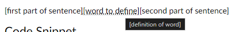
Code Snippet
<p>[first part of sentence]<abbr title="[definition of word]">[word to define]</abbr>[second part of sentence]</p>Supporting Research
Providing definitions for unfamiliar vocabulary can reduce cognitive load and improve comprehension for learners (Mayer & Moreno, 2003). The hover functionality allows for just-in-time support without distracting from the main content. This aligns with the multimedia learning principle of spatial contiguity, which suggests that related information should be presented in close proximity (Mayer, 2009). Additionally, the ability to access definitions as needed supports learner control and self-pacing, important principles of adult learning theory (Knowles, 1984).
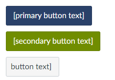
Auto-Themed Buttons
Many things can serve as buttons, but Canvas can also generate them with the Canvas theming. This can be beneficial when creating courses that will be imported to other Canvas accounts/contexts as the buttons will automatically take on their branding.
Example
Code Snippet
<a class="btn btn-group btn-primary" href="[url]">[primary button text]</a>
<a class="btn btn-group btn-info" href="[url]">[secondary button text]</a>
<a class="btn btn-group btn-publish" href="[url]">[button text]</a>
Supporting Research
Consistent branding and visual design can enhance learner engagement and create a sense of cohesion across a course (Plass et al., 2014). Auto-themed buttons ensure that the course maintains a professional appearance even when imported into different Canvas contexts. The use of different button styles (primary, secondary, publish) aligns with the multimedia learning principle of signaling, which suggests that important information should be highlighted to guide learner attention (Mayer, 2009). Clear labeling and distinct button styles can also improve usability and accessibility (W3C, 2018).
Backgrounds/Banners
Any item can have a background color added to it that stretches across the full width of the content. This can be useful to create a background color for a section to make it stand out or feel separate from the rest of the content. These can be useful for footers or headers. There are plenty of creative ways that this can be combined with other elements. For example, an image that fades to the same color as the background can seem to “grow” for different screens. If you have text against a color, ensure that there is enough contrast. You can use this tool to check the contrast. You can use this tool to find a different shade if needed.
Example

Code Snippet
<div style="background-color: #BBE5EE;">

[content within banner]

</div>
Supporting Research
Using background colors or banners to visually separate content can help organize information and guide learner attention (Malamed, 2015). This aligns with the multimedia learning principle of segmenting, which suggests that complex information should be broken down into smaller, more manageable chunks (Mayer, 2009). However, it’s important to ensure sufficient contrast between text and background colors to maintain readability and accessibility (W3C, 2018). The tools provided for checking contrast and generating shades can help instructors adhere to these guidelines.
Accordions
Accordions are “drop downs” that can be clicked on to show temporarily hidden content.
Example

Code Snippet
<details>

<summary>[title]</summary>

[content]

</details>
Supporting Research
Accordions allow for the progressive disclosure of information, which can reduce cognitive load and help learners focus on the most relevant content (Clark & Mayer, 2016). By hiding less essential information until needed, accordions align with the multimedia learning principle of coherence, which suggests that extraneous material should be minimized (Mayer, 2009). The interactive nature of accordions also promotes active learning and learner engagement (Kosslyn, 2007). However, it’s important to use clear and descriptive titles for each accordion to ensure that learners can easily find the information they need (Nielsen, 2011).
Block Quotes
Block quotes can be used to highlight important quotes or excerpts from other sources. They visually distinguish the quoted text from the rest of the content. Block quotes are typically used for longer quotes (40 words or more).
Example
A portfolio is a purposeful collection of student work that exhibits the student’s efforts, progress, and achievements in one or more areas. The collection must include student participation in selecting contents, the criteria for selection, the criteria for judging merit, and evidence of student reflection (p. 60).
Code Snippet
<blockquote>[quoted text]</blockquote>
Supporting Research
Using block quotes to highlight important passages can help draw learner attention to key concepts or ideas (Lidwell et al., 2010). This aligns with the multimedia learning principle of signaling, which suggests that essential information should be emphasized (Mayer, 2009). Block quotes also provide a visual break from the main content, which can help maintain learner engagement and reduce cognitive load (Clark & Mayer, 2016). When using block quotes, it’s important to provide proper attribution and context to maintain academic integrity and help learners understand the relevance of the quoted material (APA, 2020).
Connection Box
Text boxes are a great way to visually separate and emphasize important information, such as connections to other content, additional insights, or promotional messages. These boxes can help learners identify key takeaways, make meaningful links between different parts of the course, or discover additional learning opportunities. By using a consistent style for these text boxes, you can create a cohesive and intuitive learning experience while strategically highlighting related content or promoting relevant services or products.
Example

Code Snippet
<div style="border: 2px solid #2a4169; border-radius: 5px; padding: 10px; margin-top: 20px; background-color: #BBE5EE;">

<p><strong>\[Connection or Promotion Title\]:</strong> \[Explain how the current content relates to or builds upon another part of the course, highlight a real-world application of the concept being discussed, or promote related training, coaching, or other services.\]</p>

</div>
Supporting Research
Using visual cues, such as text boxes, to highlight important information aligns with the signaling principle of multimedia learning (Mayer, 2009). This principle suggests that learning can be enhanced when essential material is emphasized through visual or verbal cues. By drawing attention to key connections, insights, or promotional messages, text boxes can help learners focus on the most relevant information and construct meaningful mental models (Clark & Lyons, 2010). Additionally, the use of consistent visual design elements, such as borders and background colors, can improve the coherence and aesthetics of the learning experience, which can positively impact learner engagement and motivation (Plass, Heidig, Hayward, Homer, & Um, 2014).
Furthermore, highlighting connections between different parts of the course or promoting related learning opportunities supports the integration principle of multimedia learning, which suggests that learners should be explicitly prompted to make connections between related concepts (Mayer, 2009). By using text boxes to link current content to prior knowledge, real-world applications, or additional training and coaching, instructors can facilitate the transfer of learning and help learners build a more comprehensive and interconnected understanding of the subject matter (Ambrose, Bridges, DiPietro, Lovett, & Norman, 2010). Promoting relevant services or products within the context of the course can also enhance learner motivation and engagement by offering a clear path to mastery and providing opportunities for personalized support (Wlodkowski & Ginsberg, 2017).
Audio Widget
The <audio> tag allows you to upload audio files into the “files” folder in Canvas, and then make that audio playable in a Canvas page. The best file type for the web is .mp3. Embedded audio offers several advantages over embedded video when creating e-learning content. Audio files are generally easier and faster to produce compared to video, as they require less technical setup and editing. Additionally, audio content tends to age more gracefully than video, as it is less dependent on visual aesthetics and production quality that can become outdated over time. Embedded audio is also much more accessible for learners with low internet bandwidth, as audio files are typically smaller and require less data to stream than video. However, it’s important to note that embedded audio works best as supplemental content rather than essential or core information, as it may not fully engage all learning styles and preferences. When used strategically, embedded audio can enhance the e-learning experience without overwhelming learners or compromising accessibility.
Example

Example Explanation
When you place any kind of file in your “FILES’ folder in Canvas, it is assigned a file number. There are a couple of ways to find out that number. The easiest is to right-click the file and “copy URL”. Somewhere in the URL you will see the file number or ID. In addition to providing your own audio clips, the only other thing you will need to edit are the green text items in the code to reflect the file ID numbers of your sound files in your own courses. After you change those, you can copy and paste the code into your Canvas page.
- My course ID is # 134 (each course you have will have its own ID. You can get the ID by looking in the URL)
- My File ID # 17584 (this is the number of this particular sound file in my Canvas course. Your files will have their own numbers as well)
Code Snippet
<div class="description user_content student-version">

<p>Press the play button to hear from co-teachers in the field.</p>

<audio src="/courses/134/files/17584/download" controls="controls"> Your browser does not support the audio file.</audio>

</div>
Supporting Research
Embedded audio can be an effective tool for enhancing learning, particularly when used as supplementary material. According to the modality principle in multimedia learning, presenting information in both visual and auditory formats can improve learning outcomes (Mayer, 2009). However, it’s important to consider cognitive load and avoid overwhelming learners with too much simultaneous information (Sweller, 1994). By using audio strategically and ensuring that it complements rather than duplicates visual content, instructors can create a more engaging and effective learning experience (Clark & Mayer, 2016). Additionally, providing audio alternatives can improve accessibility for learners with different needs and preferences (CAST, 2018).
In-Page Scenario
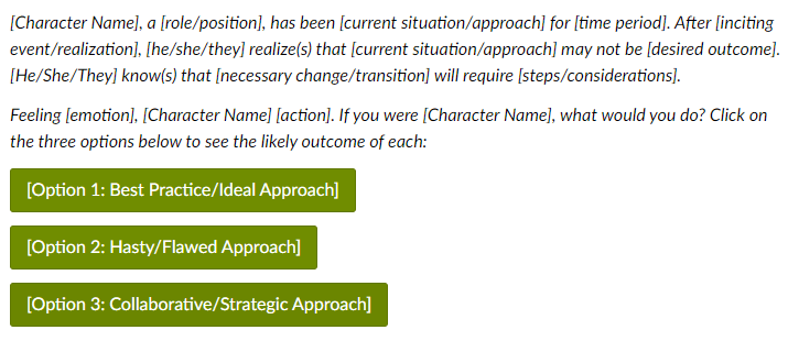
Embedding scenario-based e-learning within Canvas transforms traditional courses into immersive, interactive experiences that engage students by simulating real-life challenges. This approach allows learners to apply theoretical knowledge in practical, scenario-driven activities directly integrated into the Canvas learning management system. By designing courses that incorporate these realistic scenarios, instructors can significantly enhance the learning experience, ensuring content is deeply relevant and engaging. Mastering the integration of scenario-based e-learning into Canvas requires some effort, but the investment pays off by preparing students effectively for real-world applications, making your Canvas courses highly impactful and engaging. Feel free to adjust the template below as needed; the extra constraints are simply to show the general form of scenario-based e-learning.
Example
Code Snippet
<h2>Try This Scenario: "<em>[Scenario Title]</em>"</h2>

<p><em>[Character Name], a [role/position], has been [current situation/approach] for [time period]. After [inciting event/realization], [he/she/they] realize(s) that [current situation/approach] may not be [desired outcome]. [He/She/They] know(s) that [necessary change/transition] will require [steps/considerations].</em></p>

<p><em>Feeling [emotion], [Character Name] [action]. If you were [Character Name], what would you do? Click on the three options below to see the likely outcome of each:</em></p>

<p><a class="btn btn-group btn-info" href="#option1">[Option 1: Best Practice/Ideal Approach]</a></p>

<div id="option1" class="enhanceable_content dialog">[Character Name] [action based on best practice/ideal approach]. [He/She/They] [positive steps/actions]. By [best practice strategies], [Character Name] is able to [positive outcomes].</div>

<p><a class="btn btn-group btn-info" href="#option2">[Option 2: Hasty/Flawed Approach]</a></p>

<div id="option2" class="enhanceable_content dialog">[Character Name] [action based on hasty/flawed approach]. However, [he/she/they] soon realize(s) [challenges/obstacles]. [Stakeholders] express [concerns]. [Character Name] recognizes that [he/she/they] should have [necessary steps]. [He/She/They] resolve(s) to [corrective actions].</div>

<p><a class="btn btn-group btn-info" href="#option3">[Option 3: Collaborative/Strategic Approach]</a></p>

<div id="option3" class="enhanceable_content dialog">[Character Name] [action based on collaboration/strategy]. Together, they [collaborative/strategic actions]. They also plan to [engage stakeholders]. By collaborating with [relevant parties] and [approach to implementation], [Character Name] is able to [positive outcomes].</div>
Supporting Research
Scenario-based e-learning is a highly effective instructional strategy that promotes active learning, problem-solving, and knowledge application (Clark & Mayer, 2016). By immersing learners in realistic situations and allowing them to make decisions and see the consequences of their choices, scenario-based learning enhances engagement, motivation, and transfer of learning (Schank, Berman, & Macpherson, 1999). This approach aligns with the principles of situated learning theory, which emphasizes the importance of authentic context and social interaction in the learning process (Lave & Wenger, 1991). Additionally, providing multiple decision points and feedback within scenarios supports the development of critical thinking and self-reflection skills (Kolb, 1984).
Click-Through Case Study
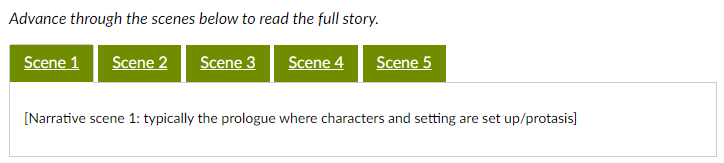
A click-through case study is an interactive story that guides learners through a character’s experience or problem-solving process. The narrative is divided into five scenes, each presented in a separate tab. Learners click through the tabs to progress through the story at their own pace. This format allows for an engaging and immersive learning experience without overwhelming the learner with too much content at once.
Example
Code Snippet
<h2>Case Study: "<em>[Case Study/Narrative Title]</em>"</h2> <p><em>Advance through the scenes below to read the full story.</em></p>
<div class="enhanceable_content tabs">
    <ul>
        <li><strong><span style="color: #ffffff; font-size: 12pt; background-color: #708d00;"><a style="color: #ffffff; background-color: #708d00;" href="#tab-1">Scene 1</a></span></strong></li>
        <li><strong><span style="color: #ffffff; font-size: 12pt; background-color: #708d00;"><a style="color: #ffffff; background-color: #708d00;" href="#tab-2">Scene 2</a></span></strong></li>
        <li><strong><span style="color: #ffffff; font-size: 12pt; background-color: #708d00;"><a style="color: #ffffff; background-color: #708d00;" href="#tab-3">Scene 3</a></span></strong></li>
        <li><strong><span style="color: #ffffff; font-size: 12pt; background-color: #708d00;"><a style="color: #ffffff; background-color: #708d00;" href="#tab-4">Scene 4</a></span></strong></li>
        <li><strong><span style="color: #ffffff; font-size: 12pt; background-color: #708d00;"><a style="color: #ffffff; background-color: #708d00;" href="#tab-5">Scene 5</a></span></strong></li>
    </ul>
    <div id="tab-1">
        <p>[Narrative scene 1: typically the prologue where characters and setting are set up/protasis]</p>
    </div>
    <div id="tab-2">
        <p>[Narrative scene 2: typically where the conflict begins]</p>
    </div>
    <div id="tab-3">
        <p>[Narrative scene 3: the rising action]</p>
    </div>
    <div id="tab-4">
        <p>[Narrative scene 4: the climax and falling action]</p>
    </div>
    <div id="tab-5">
        <p>[Narrative scene 5: denouement along with moral]</p>
    </div>
</div>
Supporting Research
Click-through case studies leverage the power of storytelling to engage learners and promote deeper understanding. Narratives can help learners connect new information to existing knowledge, foster empathy, and encourage reflection (Abrahamson, 1998). By presenting the story in a series of scenes, click-through narratives align with the segmenting principle of multimedia learning, which suggests that complex information should be broken down into smaller, more manageable chunks (Mayer, 2009). The interactive nature of clicking through the scenes also promotes active learning and learner control, which can enhance motivation and engagement (Clark & Mayer, 2016). Additionally, the realistic portrayal of characters making mistakes and learning from them can help learners develop problem-solving skills and build resilience (Jonassen, 1999).
Bootstrap Grid
I generally discourage individuals from using tables wider than two columns in Canvas. Tables do not display well on smaller mobile devices accessing Canvas. Additionally, it is easy for course instructors to accidentally resize tables. Instead of tables, individuals building choice boards or menus of Buttons can use Bootstrap Grids. Bootstrap grids allow for all page content to scale dynamically and work well on any device. Bootstrap grids can have a bit of a learning curve, but they offer the most customization for how content displays on a page in Canvas. If you need to build a world-class course, take the time to learn these. You can learn the basics of how bootstrap grids work in Canvas in the video below. The example and snippet below are sized for buttons or choice grids. Consider pairing bootstrap grids with background colors/banners and other elements to make more rich content.
Example

Code Snippet
<div class="grid-row">

<div class="col-lg-3 col-md-4 col-sm-6 col-xs-12">[content]</div>

<div class="col-lg-3 col-md-4 col-sm-6 col-xs-12">[content]</div>

<div class="col-lg-3 col-md-4 col-sm-6 col-xs-12">[content]</div>

<div class="col-lg-3 col-md-4 col-sm-6 col-xs-12">[content]</div>

[can repeat line above as needed; adjust sizing as desired]

</div>
Supporting Research
The use of responsive grid systems, such as Bootstrap, is a well-established best practice in web design and e-learning development. Responsive grids ensure that content is displayed optimally across a wide range of devices and screen sizes, enhancing usability and accessibility (Marcotte, 2011). This aligns with the principle of universal design for learning (UDL), which emphasizes the importance of providing multiple means of representation, action, and engagement to accommodate diverse learner needs (CAST, 2018). By using Bootstrap grids instead of fixed-width tables, instructors can create more flexible and inclusive learning experiences that adapt to individual learner preferences and contexts (Meyer, Rose, & Gordon, 2014). Additionally, the modular nature of grid systems supports the chunking of information into manageable pieces, which can help reduce cognitive load and improve learning outcomes (Clark & Mayer, 2016).
Page Templates
Full page templates are intended as purely a jumping off point for the design system but should not be prescriptively followed. They can be used to quickly start drafting a course. The code in here is directly copied from the original template and, as such, will need to be adjusted for your instance. Implementation of these is easier from the Canvas Export Package at the top of this guide. Click here to see full page templates.
Home Page
Example
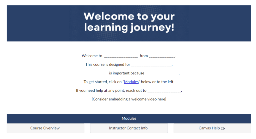
HTML Code
<div style="background-color: #2a4169;">
<p style="text-align: center;"><img id="11077" role="presentation" src="https://bhssc.instructure.com/courses/134/files/11148/preview" alt="" data-api-endpoint="https://bhssc.instructure.com/api/v1/courses/134/files/11148" data-api-returntype="File" /></p>
</div>
<div style="text-align: center;">
<div>
<p> </p>
<p style="text-align: center;"><span>Welcome to </span><span>___________________ from _______________.</span></p>
<p style="text-align: center;"><span>This course is designed for _______________________.</span></p>
<p style="text-align: center;"><span>_________________ is important because ___________________.</span></p>
<p style="text-align: center;"><span>To get started, click on "<a title="Modules" href="https://bhssc.instructure.com/courses/134/modules" data-api-endpoint="https://bhssc.instructure.com/api/v1/courses/134/modules" data-api-returntype="[Module]">Modules</a>" below or to the left.</span></p>
<p style="text-align: center;"><span>If you need help at any point, reach out to ___________________.</span></p>
<p style="text-align: center;"><span>[Consider embedding a welcome video here]</span></p>
<p style="text-align: center;"> </p>
</div>
<div class="grid-row">
<div class="col-lg-12 col-md-12 col-sm-12 col-xs-12"><a class="btn btn-group btn-primary" href="https://bhssc.instructure.com/courses/134/modules" data-api-endpoint="https://bhssc.instructure.com/api/v1/courses/134/modules" data-api-returntype="[Module]">Modules</a></div>
</div>
<div class="grid-row">
<div class="col-lg-4 col-md-4 col-sm-12 col-xs-12"><a class="btn btn-group btn-publish" href="https://bhssc.instructure.com/courses/134/pages/course-overview" data-api-endpoint="https://bhssc.instructure.com/api/v1/courses/134/pages/course-overview" data-api-returntype="Page">Course Overview</a></div>
<div class="col-lg-4 col-md-4 col-sm-12 col-xs-12"><a class="btn btn-group btn-publish" href="https://bhssc.instructure.com/courses/134/pages/instructor-info" data-api-endpoint="https://bhssc.instructure.com/api/v1/courses/134/pages/instructor-info" data-api-returntype="Page">Instructor Contact Info</a></div>
<div class="col-lg-4 col-md-4 col-sm-12 col-xs-12"><a class="btn btn-group btn-publish" href="https://community.canvaslms.com/t5/Canvas-LMS/ct-p/canvaslms?tab=recent">Canvas Help</a></div>
</div>
<p> </p>
<h3 id="h.xes0qbfygdk9" class="CDt4Ke zfr3Q OmQG5e" dir="ltr"></h3>
</div>Course Overview
Example
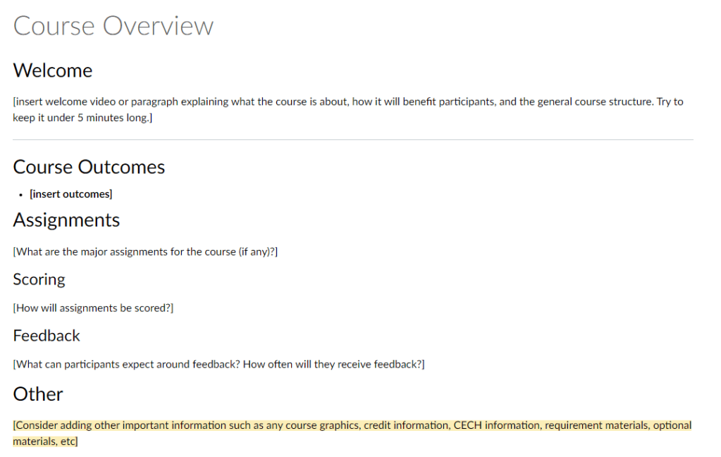
HTML Code
<h2>Welcome</h2>
<p>[insert welcome video or paragraph explaining what the course is about, how it will benefit participants, and the general course structure. Try to keep it under 5 minutes long.]</p>
<hr />
<h2>Course Outcomes</h2>
<ul>
<li><strong><span style="color: #000000;">[insert outcomes]</span></strong></li>
</ul>
<h2>Assignments</h2>
<p>[What are the major assignments for the course (if any)?]</p>
<h3>Scoring</h3>
<p>[How will assignments be scored?]</p>
<h3>Feedback </h3>
<p>[What can participants expect around feedback? How often will they receive feedback?]</p>
<h2>Other</h2>
<p><span style="background-color: #fbeeb8;">[Consider adding other important information such as any course graphics, credit information, CECH information, requirement materials, optional materials, etc]</span></p>Instructor Info
Example

HTML Code
<h2>About Me</h2>
<p>[Consider recording a short "about me" video in place of a paragraph. Try to include credentials that add to your credibility on the subject. Try to also add a few elements that allow individuals to relate to you/help them feel like they know you. A video is recommended as it allows participants to see and hear from you. Try to keep it under 5 minutes long.]</p>
<h2>Contact Me</h2>
<ul>
    <li>Email:</li>
    <li>Phone Number:</li>
    <li>Office Hours:</li>
    <li>Booking Link:</li>
</ul>
<p>[Consider adding additional information such as typical response times. Make it as easy as possible for individuals to reach out to you and know what to expect.]</p>
Module Overview
Example
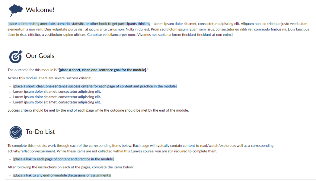
HTML Code
<h2><img id="11062" role="presentation" src="https://bhssc.instructure.com/courses/134/files/11062/preview" alt="" data-inst-icon-maker-icon="true" data-download-url="https://bhssc.instructure.com/files/11062/download?download_frd=1&icon_maker_icon=1" data-api-endpoint="https://bhssc.instructure.com/api/v1/courses/134/files/11062" data-api-returntype="File" /> Welcome!</h2>
<p>[<span style="background-color: #c2e0f4;">place an interesting anecdote, scenario, statistic, or other hook to get participants thinking</span> - Lorem ipsum dolor sit amet, consectetur adipiscing elit. Aliquam non leo tristique justo vestibulum elementum a non velit. Duis vulputate purus nisi, at iaculis ante varius non. Nulla in dui est. Proin sed dictum ipsum. Etiam sem risus, consectetur eu nibh vel, commodo finibus mi. Duis faucibus diam in risus efficitur, a vestibulum sapien ultrices. Curabitur vel ullamcorper nunc. Vivamus nec sapien a lorem tincidunt tincidunt at non enim.]</p>
<p> </p>
<h2><img id="11071" role="presentation" src="https://bhssc.instructure.com/courses/134/files/11071/preview" alt="" data-inst-icon-maker-icon="true" data-download-url="https://bhssc.instructure.com/files/11071/download?download_frd=1&icon_maker_icon=1" data-api-endpoint="https://bhssc.instructure.com/api/v1/courses/134/files/11071" data-api-returntype="File" /> Our Goals</h2>
<p>The outcome for this module is <strong>"[<span style="background-color: #c2e0f4;">place a short, clear, one-sentence goal for the module</span>]."</strong></p>
<p>Across this module, there are several success criteria:</p>
<ul>
<li><span style="color: #2a4169;"><strong>[<span style="background-color: #c2e0f4;">place a short, clear, one-sentence success criteria for each page of content and practice in the module</span>]</strong></span></li>
<li><span style="color: #2a4169;"><strong>Lorem ipsum dolor sit amet, consectetur adipiscing elit. </strong></span></li>
<li><span style="color: #2a4169;"><strong>Lorem ipsum dolor sit amet, consectetur adipiscing elit. </strong></span></li>
<li><span style="color: #2a4169;"><strong>Lorem ipsum dolor sit amet, consectetur adipiscing elit. </strong></span></li>
</ul>
<p>Success criteria should be met by the end of each page while the outcome should be met by the end of the module. </p>
<p> </p>
<h2><img id="11073" role="presentation" src="https://bhssc.instructure.com/courses/134/files/11073/preview" alt="" data-inst-icon-maker-icon="true" data-download-url="https://bhssc.instructure.com/files/11073/download?download_frd=1&icon_maker_icon=1" data-api-endpoint="https://bhssc.instructure.com/api/v1/courses/134/files/11073" data-api-returntype="File" /> To-Do List</h2>
<p>To complete this module, work through each of the corresponding items below. Each page will typically contain content to read/watch/explore as well as a corresponding activity/reflection/experiment. While these items are not collected within this Canvas course, you are still required to complete them.</p>
<ul>
<li>[<span style="background-color: #c2e0f4;">place a link to each page of content and practice in the module</span>]</li>
</ul>
<p>After following the instructions on each of the pages, complete the items below:</p>
<ul>
<li>[<span style="background-color: #c2e0f4;">place a link to any end-of-module discussions or assignments</span>]</li>
</ul>Module Page/Content Page
Example

HTML Code
<div class="border border-trbl border-round" style="background-color: #2a4169; padding: 10px; text-align: center; color: #33334d; font-size: xx-large;"><span style="color: #ffffff;"><strong>[page topic]</strong></span></div>
<ul style="padding: 10px;">
<li><strong>Outcome: "[<span style="background-color: #c2e0f4;">enter outcome here in bold; think of outcomes as the goal for the module</span>]"</strong></li>
<li><span style="color: #2a4169;"><strong>Success Criteria: "[<span style="background-color: #c2e0f4;">enter success criteria here; think of success criteria as the goal for the page</span>]"</strong></span></li>
</ul>
<hr class="border-round" style="background-color: #2a4169; height: 10px; margin: auto;" />
<p> </p>
<h2><img id="11070" role="presentation" src="https://bhssc.instructure.com/courses/134/files/11070/preview" alt="" data-inst-icon-maker-icon="true" data-download-url="https://bhssc.instructure.com/files/11070/download?download_frd=1&icon_maker_icon=1" data-api-endpoint="https://bhssc.instructure.com/api/v1/courses/134/files/11070" data-api-returntype="File" /> [<span style="background-color: #c2e0f4;">read/explore/watch topic</span>]</h2>
<p>[<span style="background-color: #c2e0f4;">add content here</span> - Lorem ipsum dolor sit amet, consectetur adipiscing elit. Aliquam non leo tristique justo vestibulum elementum a non velit. Duis vulputate purus nisi, at iaculis ante varius non. Nulla in dui est. Proin sed dictum ipsum. Etiam sem risus, consectetur eu nibh vel, commodo finibus mi. Duis faucibus diam in risus efficitur, a vestibulum sapien ultrices. Curabitur vel ullamcorper nunc. Vivamus nec sapien a lorem tincidunt tincidunt at non enim.]</p>
<h3>[<span style="background-color: #c2e0f4;">sub topic</span>]</h3>
<p>[<span style="background-color: #c2e0f4;">add content here</span> - Lorem ipsum dolor sit amet, consectetur adipiscing elit. Aliquam non leo tristique justo vestibulum elementum a non velit. Duis vulputate purus nisi, at iaculis ante varius non. Nulla in dui est. Proin sed dictum ipsum. Etiam sem risus, consectetur eu nibh vel, commodo finibus mi. Duis faucibus diam in risus efficitur, a vestibulum sapien ultrices. Curabitur vel ullamcorper nunc. Vivamus nec sapien a lorem tincidunt tincidunt at non enim.]</p>
<p> </p>
<h2><img id="11065" role="presentation" src="https://bhssc.instructure.com/courses/134/files/11065/preview" alt="" data-inst-icon-maker-icon="true" data-download-url="https://bhssc.instructure.com/files/11065/download?download_frd=1&icon_maker_icon=1" data-api-endpoint="https://bhssc.instructure.com/api/v1/courses/134/files/11065" data-api-returntype="File" /> [<span style="background-color: #c2e0f4;">practice/experiment/reflect/other on topic</span>]</h2>
<p>[<span style="background-color: #c2e0f4;">enter instructions for uncollected assignment, prompt or task that is related to what they just read, explored, or watched</span> - Lorem ipsum dolor sit amet, consectetur adipiscing elit. Aliquam non leo tristique justo vestibulum elementum a non velit. Duis vulputate purus nisi, at iaculis ante varius non. Nulla in dui est. Proin sed dictum ipsum. Etiam sem risus, consectetur eu nibh vel, commodo finibus mi. Duis faucibus diam in risus efficitur, a vestibulum sapien ultrices. Curabitur vel ullamcorper nunc. Vivamus nec sapien a lorem tincidunt tincidunt at non enim.]</p>Assignment
Example

HTML Code
<h2><img id="11072" role="presentation" src="https://bhssc.instructure.com/courses/134/files/11072/preview" alt="" data-inst-icon-maker-icon="true" data-download-url="https://bhssc.instructure.com/files/11072/download?download_frd=1&icon_maker_icon=1" data-api-endpoint="https://bhssc.instructure.com/api/v1/courses/134/files/11072" data-api-returntype="File" /> [<span style="background-color: #c2e0f4;">Assignment Instructions</span>]</h2>
<p>[<span style="background-color: #c2e0f4;">enter assignment instructions here; make sure that assignment is directly assessing the outcomes and success criteria set forth</span> - Lorem ipsum dolor sit amet, consectetur adipiscing elit. Aliquam non leo tristique justo vestibulum elementum a non velit. Duis vulputate purus nisi, at iaculis ante varius non. Nulla in dui est. Proin sed dictum ipsum. Etiam sem risus, consectetur eu nibh vel, commodo finibus mi. Duis faucibus diam in risus efficitur, a vestibulum sapien ultrices. Curabitur vel ullamcorper nunc. Vivamus nec sapien a lorem tincidunt tincidunt at non enim.]</p>
<p> </p>
<h2><img id="11069" role="presentation" src="https://bhssc.instructure.com/courses/134/files/11069/preview" alt="" data-inst-icon-maker-icon="true" data-download-url="https://bhssc.instructure.com/files/11069/download?download_frd=1&icon_maker_icon=1" data-api-endpoint="https://bhssc.instructure.com/api/v1/courses/134/files/11069" data-api-returntype="File" /> [<span style="background-color: #c2e0f4;">Additional Resources</span>]</h2>
<ul>
<li>[<span style="background-color: #c2e0f4;">add additional/takeaways resources here</span>]</li>
</ul>Structure & Design
Canvas can be used to support in-person workshops, to manage smaller conferences, to deliver cohort-based learning experiences, to provide on-demand self-paced e-learning, and more.
Module Structures
Course Design Frameworks
It is important to plan out all of these experiences first by considering the needs of the audience, the context, and the aims of the learning. Everything flows down from this early analysis.
There are plenty of course design frameworks out there:
However, I recommend sticking loosely to ADDIE, Action Mapping, or the Spiral Model for most situations at BHSSC. ADDIE is one of the oldest and most popular of the models, and, as such, has plenty of resources freely available. I recommend the Spiral Model as it encourages designers to test ideas early on through a “demonstrate” phase. Cennamo & Kalk’s Real-World Instructional Design is an invaluable tool for this. Action Mapping is beneficial when you want to communicate a plan quickly to a client and show how the training will affect their bottom line.
If you want a document that will walk you through this process, consider using the training design document below based on Cennamo and Kalk’s Spiral Model:
An updated and more concise version is below:
Key Considerations
Accessibility
Every Canvas course needs to be accessible and mobile-friendly. Thankfully, Canvas makes this process relatively easy. Every time you edit in a Rich Content Editor within Canvas, you have access to their “Accessibility Checker.” It is located in the bottom bar of the RCE and looks like a person inside a circle.
When accessibility issues arise, it will indicate as such by having a number appear next to the icon. This number is the number of accessibility concerns raised by the tool.
To solve issues, click on the icon and follow the steps presented.
Beyond the Accessibility Checker
While the accessibility checker is a great start, it cannot catch everything. Moreover, its guidelines are not universal. There may be additional accessibility requirements when creating courses for external entities such as the South Dakota Department of Education. For example, the SDDOE has to follow both the WCAG 2.1 website accessibility guidelines and Section 508 standards. It is recommended that you obtain any accessibility guidelines from such organizations and entities early in the course design process. If you are curious as to how Canvas meets different accessibility guidelines, consult this document.
Additional Accessibility Recommendations & Tools
- Always use the HTML-based text styles from the dropdown. Use them to structure information in a hierarchy.
- Ensure that the contrast between text and background is of a great enough ratio. If text is within a graphic in Canvas, the Accessibility Checker may not address it.
- You can check contrast with WebAIM’s contrast checker tool.
- If you find that the contrast is not great enough, you can use the shadegenerator tool to try different shades of the same color.
- Keep critical content below an eighth-grade reading level. You can test readability at Hemmingway Editor.
Mobility
Another area where the accessibility checker falls flat is when designing a course to be used on mobile devices. Canvas courses are often designed on desktops and are often designed by individuals with access to a second screen or a larger display. As such, it can be easy for designers to fall into the trap of designing only for their own device, a device that is not necessarily representative of the average user.
Thankfully, it is easy to test how a course will look on mobile. If you are using the Chrome browser, you can view any page in any set of dimensions through the Developer Tools. To access your Developer Tools, use Ctrl+Shift+I or click on the three dots in the top right corner, click on “more tools,” and then select “Developer Tools.” From there, you can choose from several presets or enter your own dimensions. Your course should work well on the smallest default dimensions of 375 x 667.
Additional Mobility Recommendations
- Keep tables no wider than two columns and use all tables sparingly. Instead, use bootstrap grids or rearrange content. Lists often work just as well as tables. When tables are needed, consider providing an alternative layout of content for those who need it. This could be a second page linked to the main page.
- Use graphic-based “buttons” in Canvas sparingly. “Buttons” made through hyperlinked graphics often display incorrectly or wrap poorly on mobile devices.
- While it is much harder to accommodate in Canvas and certainly not an expectation, you can try to reduce the text to 75 characters per line. This is useful for participants as research shows long text lines can be difficult to read. You can use graphics and various tricks such as single-cell tables to ensure that content width does not extend too far if desired. Even this template does not follow this guidance. For more information, consult Baymard Institute’s article.
Usability
Beyond that, courses should be simple to use and navigate. While this topic is harder to cover in a short blurb as heuristics do not suffice, some resources are below.
- Don’t Make Me Think – Key Learning Points for UX Design for the Web
- User Experience Basics from Usability.gov
- User Experience Community at Digital.gov
- UX Basics: Study Guide from Nielsen Norman Group
Ultimately, the best way to build a user-friendly course is to ignore your own preferences and listen to what participants tell you. Soliciting feedback on layout, navigation, and usage is always good practice. For example, I invite you to reach out with feedback on this template!
Instructional Videos
While Instructional Videos are not the focus of this system, a brief guide is available below:
Change Log
- Version 1.0 – Original Version
- Version 1.1 – Addition of example module layout “module 1” with blank pages and link to Canvas resources for students.
- Version 1.11 – Change of font size for outcomes and success criteria component from 14 pt bold to 12 pt bold
- Version 1.12 – Change of font color for success criteria in outcomes and success criteria component from BHSSC green to CFS? light blue for accessibility
- Version 1.13 – Change of font color for success criteria back to BHSSC blue (success criteria) and plain black (outcomes) to make it more flexible
- Version 1.2 – Added additional example content into an example module. These are simply examples rather than a prescriptive outline of how training must be formatted. Added additional links at the top for help. Linked additional videos on the accessibility page.
- Version 1.3 – Added black alternatives to in-page icons. Added them not through the icon maker to accommodate transferring to platforms that do not have the icon maker enabled. Fixed content pages that had additional bracket at the bottom.
- Version 1.31 – Added alternative buttons to quick components
- Version 1.4 – Added a three-chili component page and added in a prewritten, embeddable scenario-based e-learning item. Added supporting research to different quick components.
- Version 1.5 – Added another three-chili component for embeddable audio and added supporting research the the three-chili components. Added a quick component on the immersive reader and corresponding green icon. Added CECH/Credit Module as it was needed more often than initially anticipated.
- Version 1.51 – Linked slide deck on created instructional videos.
- Version 1.52 – Added case study component and block quote component
- Version 1.53 – Updated colors and formatting of some components, did not adjust actual content at all
- Version 1.54 – Connnection quick component was added to level 3 components
- Version 1.60 – Three-chili structure was reworked from organized by difficulty to organized by implementation and icons folded under this rework. Added new text based component on optional social media
 Brady Licht