
The first version of my course builder had a problem, and the problem was me.
I had been building a personal tool to accelerate the most repetitive parts of course development in Canvas LMS. The idea was straightforward: use AI to draft instructional content, generate Canvas-ready HTML, and push pages through the API so that the tedious labor of formatting and tweaking would not eat up the hours better spent on actual design decisions. The tool worked. It could take a set of course parameters and produce a full set of module pages, complete with outcomes, activities, and quiz questions, faster than I could build a single module by hand.
And when I sat down to test it, I found myself doing something I had not anticipated. I was skipping through everything. Generating content, glancing at it, generating the next batch, glancing at that. I was not reviewing. I was not designing. I was watching AI produce things and feeling productive because things were appearing on screen. When I showed it to a few colleagues, the impulse got worse. The demo moments that impressed people were the moments where AI generated an entire module from scratch. The “wow” was in the speed, not in the quality of the decisions being made along the way.
That experience changed how I thought about the tool entirely. What I realized is that the most impressive thing about an AI-powered tool, the thing that makes people lean forward in a demo, is actually the thing that makes the tool most dangerous in practice. The generate button is easy. The harder design challenge is building a tool that refuses to let you treat it like a vending machine.
This article is not a walkthrough of the tool itself. It is about what I learned while building it, and what those lessons suggest about how we should think about designing any tool that puts AI in the middle of professional work.
The Design Problem
When a tool makes it easy to skip ahead, people skip ahead. Not because they are careless, but because the tool’s design rewards speed and the human instinct to keep momentum going is genuinely powerful. In a workflow where generating content takes seconds and reviewing content takes minutes, the path of least resistance is always to generate more and review less. The tool does not need to actively encourage you to skip the hard parts. It just needs to not require you to do them.
Most AI-powered tools in education treat human review as a suggestion. They generate output, present it, and then leave it to the user to decide how carefully to engage with it. The interface might say “review this,” but the workflow says “here is the next thing to generate.” There is no structural barrier between generation and use. There is no mechanism that helps the user distinguish between the parts of the output that are likely solid and the parts that need their expert scrutiny.
What I have found, both in building my own tools and in watching how people use AI-powered EdTech more broadly, is that keeping human expertise central to an AI-assisted workflow is fundamentally a design problem. If you want professional judgment to remain part of the process, you have to build the slowdown into the tool itself. You cannot rely on the user to voluntarily pump the brakes while the tool is handing them a faster car.
Structural Gates vs. Optional Checkpoints
The distinction I keep coming back to is between optional review and structural gates. An optional review is what most AI tools offer: here is the output, take a look, click “next” when you are ready. A structural gate is different. It is a point in the workflow where the tool will not advance until a human has made a specific decision that the AI cannot make for them.
The difference matters because optional reviews are psychologically easy to skip. You can glance, nod, and move on. A structural gate forces a different kind of engagement. It says: this is a decision point, and the tool needs your answer before it can proceed. Not your approval of what AI generated, but your judgment about something AI does not have the context to decide on its own.
When I rebuilt my course builder after that first round of testing, I organized it around a five-stage pipeline (Define, Design, Demonstrate, Develop, Deliver) where each stage has deliberate structural gates. What matters more than the model itself is what happens at the boundaries between stages. The tool will not let you move from one stage to the next without specific kinds of human input, and that input is not “click to confirm.” It is “make a choice that shapes what comes next.”
Where the Human Actually Needs to Be
The question that drove the redesign was not “where should a human review AI output?” It was a different question: “where in this process does the quality of the outcome depend on a kind of judgment that AI does not have?” Those are not the same question, and the difference between them is worth sitting with.
Review asks: “Is this good enough?” Judgment asks: “What should this be?” The first question can be answered quickly, often with a shrug. The second requires you to bring something to the table that the tool cannot generate for you: your knowledge of the audience, your sense of what will work in a particular context, your professional experience with what learners actually struggle with.
Let me walk through how this plays out in practice.
Setting Direction, Not Confirming It
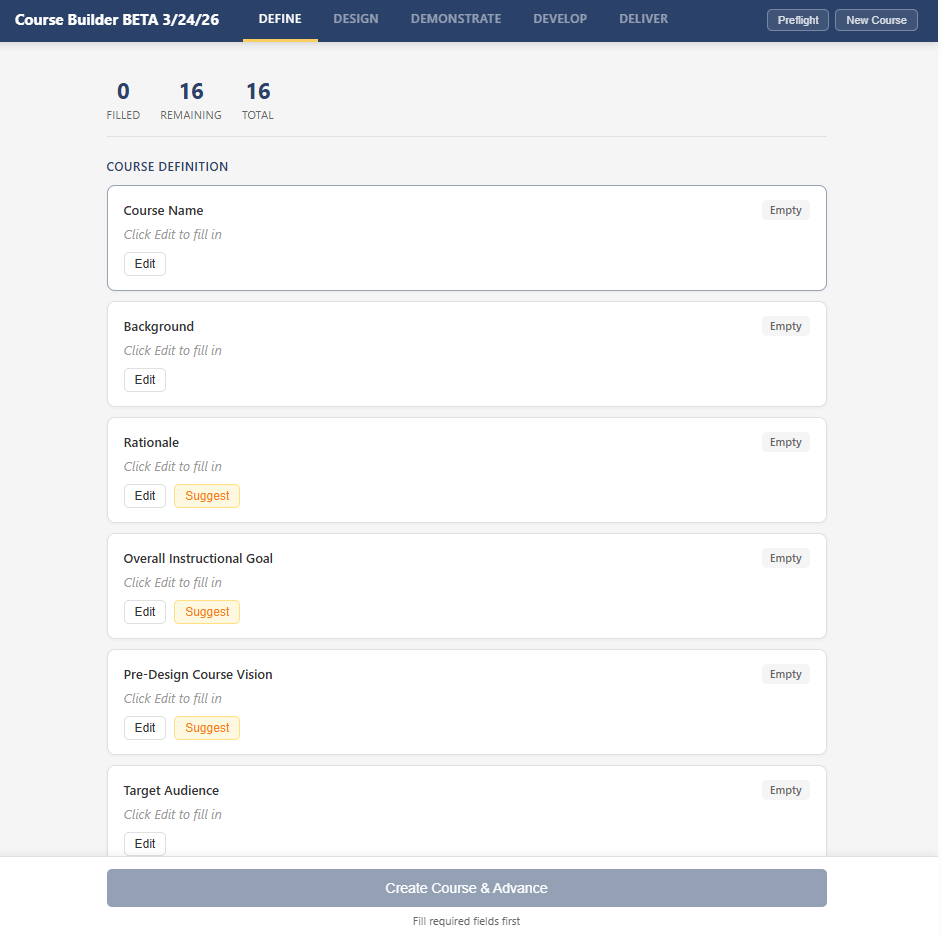
In the first stage of the tool, the designer fills in 16 fields that establish the foundation for the course: what it is about, who it is for, what the outcomes should be, what voice and tone to use, which high-impact instructional strategies to emphasize. Seven of those fields have an AI suggestion capability. When the designer clicks “Suggest,” the tool generates three distinct options, each representing a meaningfully different approach. For learning outcomes, for example, the three options might emphasize different levels of Bloom’s taxonomy. For voice and tone, the options might range from warm and collegial to expert mentor to curious facilitator.
The designer reads all three, selects one, edits it, or writes something entirely different. AI never fills in a field on its own. It proposes; the designer disposes. By the time this stage is complete, every value in it reflects a human decision. That is not a review step. It is a design step that happens to use AI-generated options as raw material.
What this means in practice is that a typical Define stage involves 25 to 40 individual human inputs: filling fields, reviewing options, selecting, editing, and re-reviewing. It usually takes 30 to 60 minutes of active work. That might sound like a lot for what amounts to “setting up the course,” but those 30 to 60 minutes are doing the conceptual heavy lifting that every subsequent stage depends on. If the outcomes are vague, the generated content will be vague. If the audience definition is generic, the scenarios will be generic. The tool’s design makes this investment unavoidable, which is the point.
Shaping the Blueprint, Not Approving It
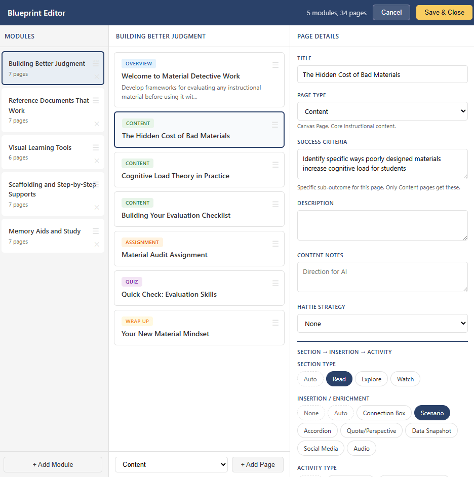
The second stage produces a course blueprint: which modules exist, what pages each module contains, what type each page is, what activities and enrichment components it uses. AI drafts the initial blueprint based on the Define inputs, but the draft lands in an editor where every element is editable. The designer can reorder modules, add or remove pages, change page types, swap activity types, edit titles and descriptions, and regenerate individual rows with specific notes about what to improve.
Contextual guidance shows up throughout. When the designer selects a page type, the detail panel explains the downstream implications: content pages produce Canvas Pages with a section/enrichment/activity structure, assignment pages create collected Canvas Assignment objects, discussion pages create threaded Canvas Discussion Topics (distinct from the “Peer Discussion” activity type, which encourages real-life colleague conversation). Quiz pages note that questions are auto-generated from module content. This is the kind of information that helps a designer make informed choices rather than just accepting defaults.
For a typical five-module course with 25 to 35 pages, the designer reviews every page entry and typically edits 60 to 80 percent of them: adjusting titles to be more specific, rewriting success criteria to be more measurable, swapping activity types to create variety across a module, adding content notes with direction that only someone with subject matter knowledge could provide. A thorough Design review involves 50 to 100 individual edits and usually takes 45 to 90 minutes.
The tool will not advance past this stage until the designer has saved the blueprint. There is no “auto-generate the whole course” path because the blueprint is the architectural plan. Skipping it would be like letting AI draw the floor plan for a house and then starting construction without checking whether the rooms make sense.
The Module 1 Pattern
One structural decision in particular changed how the tool worked in practice, and I think it illustrates a principle that applies well beyond course building.
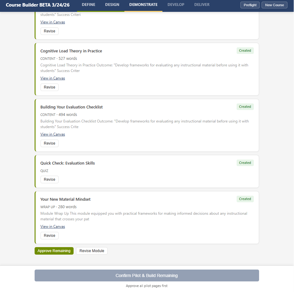
When the tool moves to content generation, it does not batch-generate the entire course. It generates Module 1 first, pushes every page to Canvas, and then stops. The designer reviews the pages in Canvas itself, not in a preview pane or a staging area, but in the actual LMS environment where learners will encounter them. They see the formatting, the icon placement, the spacing, the immersive reader link, the activity framing. For each page, the designer can approve it, flag it with correction notes, or reset its status.
Here is the part that matters most. When the designer flags pages and adds correction notes (“scenarios should reference South Dakota schools specifically,” or “too many accordion sections in a row, vary the format”), those corrections are aggregated into a patterns document that gets injected into every subsequent module’s generation prompts. Module 2’s content is shaped by the designer’s feedback on Module 1. Module 3 benefits from feedback on both. The designer’s early investment in careful review compounds across the entire course.
The transferable principle is that front-loading the most careful review to the first instance of a repeating pattern is far more effective than distributing review equally across all instances. If you build a tool that generates twenty things and asks the user to review all twenty with equal attention, they will not. Attention is a finite resource. But if you build a tool that demands deep engagement with the first iteration and then applies what it learned to the remaining ones, you get better outcomes from less total review time. The design respects the reality of how people actually work rather than pretending they will be equally careful on item seventeen as they were on item one.
Naming What AI Cannot Do
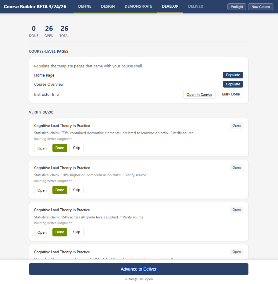
After content generation and review, the tool enters a stage that is entirely human-driven. No AI generation of module content happens. Instead, the tool scans everything it has produced and creates a task list organized into four categories, each requiring a different kind of human work:
- Verify tasks flag things AI wrote confidently but cannot guarantee: external links that need to be checked (deduplicated by URL, so one link appearing on three pages creates one task, not three), statistics and research claims identified by pattern matching, and scenarios containing proper nouns that might inadvertently match real people or institutions.
- Embed tasks flag places where real media needs to replace AI-generated placeholders: video references without embeds, audio components from enrichment sections, image references without actual files.
- Create tasks identify course-level pages that need to be populated: the Home Page and Course Overview can use AI-generated drafts that the designer reviews in Canvas, but the Instructor Info page is explicitly manual-only because AI should not generate personal information about a real person.
- Configure tasks flag Canvas administration decisions that require judgment: setting the front page, reviewing module order, configuring navigation items.
Every task has a direct link to the relevant Canvas page so the designer can go straight to the item that needs attention. The task list is persistent and shareable, living in a sheet in the workbook rather than just the sidebar, so a colleague can handle specific tasks without needing to understand the full tool.
What I find interesting about this stage is that it represents the tool being honest about its own limitations. Rather than generating everything and hoping the user catches the problems, it proactively identifies the categories of work it knows it cannot do well. It says, in effect: here are the things I am not qualified to handle, they are your job, and here is where to find them. This is a design pattern I think more AI tools need. Not just pausing for review, but actively surfacing what is most likely to need human attention and why.
Counting the Decisions
When I tallied up the human touchpoints across a typical five-module course build, the numbers surprised me. The designer makes roughly:
- 25 to 40 inputs during Define (field entries, option reviews, selections, edits)
- 50 to 100 edits during Design (blueprint review, title adjustments, component selections)
- 30 to 50 approve/flag decisions during Demonstrate, plus 5 to 15 typed correction notes
- 15 to 30 task completions during Develop (link verification, media embedding, page population, Canvas configuration)
- 8 to 12 form inputs plus 6 task completions during Deliver
That is roughly 130 to 250 individual human decisions and actions for a single course. The tool automates the HTML generation, the Canvas API calls, the quiz question creation, the icon mapping, the module item ordering, and the listing description assembly. It does not automate any decision about what to teach, how to teach it, whether the content is accurate, or when to make it public.
I share these numbers not because they are specific to this tool, but because they illustrate a principle that I think gets lost in how we talk about AI in professional work. The value of an AI-assisted tool is not measured by how much it generates. It is measured by how clearly it separates what AI should handle (repetitive labor with predictable patterns) from what humans should handle (judgment, context, verification, and quality standards). When that separation is designed well, the human’s workload does not disappear, but it shifts from labor to decisions. And decisions are where professional expertise actually lives.
Designing for Human Judgment
If there is a practical takeaway from all of this, it comes down to a set of design principles that I think apply whether you are building a custom script, choosing an EdTech product, or just thinking about how AI fits into your own workflow.
- Build the gates into the structure, not the instructions. Telling users to review carefully is not a design strategy. If a decision point matters, the tool should not advance until that decision is made. The difference between “we encourage you to review” and “the tool will not proceed until you review” is the difference between a suggestion and a structural feature.
- Distinguish between review and judgment. Review asks whether something is acceptable. Judgment asks what something should be. The most important human touchpoints in an AI-assisted workflow are not the places where users approve output, but the places where they provide input that AI cannot generate: audience knowledge, contextual fit, quality standards, and professional experience. Design around judgment, not just review.
- Front-load the careful work. People cannot sustain equal attention across 30 identical review tasks. But they can sustain deep attention on the first one if the tool makes that investment carry forward. The Module 1 pattern, where corrections to the first iteration become standing instructions for all subsequent iterations, works because it respects the reality of how attention actually works. Design for the first one to matter most.
- Make the tool honest about its own limitations. Rather than presenting all output as a uniform block for the user to evaluate, pre-sort it. Flag the categories of content where AI is most likely to be wrong (links, statistics, proper nouns, media references) and make those flags visible and actionable. Give the user a starting point for their review that reflects what the tool knows about its own weaknesses.
- Count the human decisions, not just the automated steps. When evaluating any AI-assisted tool, look at where it stops and what it asks the user to decide. A tool that automates 90 percent of the labor but preserves 100 percent of the judgment is doing something fundamentally different from a tool that automates 90 percent of everything and hopes the user catches the remaining 10 percent. The number of human decisions in a workflow is a better measure of whether the tool respects professional expertise than the amount of time it saves.
What I Am Still Figuring Out
I do not want to end this with a neat resolution, because the honest truth is that some of these tensions are ongoing.
One that I notice consistently is the gap between what sells a tool and what makes a tool responsible. The features that impress in a demo (speed, automation, impressive output from scratch) are often in direct tension with the features that produce good outcomes (forced slowdowns, mandatory review, honest surfacing of limitations). The version of my tool that generated everything at once got excited reactions from colleagues. The version with structural gates got more measured responses, followed by better results when people actually used it. I do not have a clean answer for how to navigate that tension, but I think anyone building or evaluating AI tools for professional contexts needs to be aware of it.
Another tension is around how much structure is enough. Every gate I add to the tool is a point of friction for the designer, and friction is not inherently good. There is a version of this approach that becomes so cautious and so gate-heavy that it defeats the purpose of using AI at all. I have not found that line yet, but I know it exists, and I think it is specific to context rather than universal. The right amount of human oversight for building a course with 30 pages of instructional content is different from the right amount for generating a set of discussion prompts.
What I keep coming back to is the underlying question: when we build tools that use AI, are we designing for the human decisions that matter, or are we designing around them? The answer, I think, is visible in the architecture of the tool itself. Look at where it stops. Look at what it asks you to decide. Look at whether it helps you understand where your expertise is most needed, or whether it treats your review as a rubber stamp on the way to the next generate button.
If you are thinking about these questions in your own work, whether you are building tools, evaluating them, or just trying to figure out where AI fits into your practice, I would love to hear what you are finding. You can reach me at licht.education@gmail.com, and there are more articles and tools at bradylicht.com.
