
Note: Due to contractual requirements, the specific state education department involved in this project can’t be identified. This case study focuses on the UX design process while maintaining client confidentiality, and the screenshots included don’t reveal the client’s identity.
A UX exploration phase for a state social studies resource website that combined competitive analysis with three co-design methods to produce a feature framework and prototype connecting historical society content to classroom standards.
- Project Type: UX design exploration and competitive analysis
- Audience/Client: State education department and historical society (confidential)
- Role: UX research and design lead
- Format & Deliverables: Competitive analysis of 23 educational resource sites; co-design sessions using Round Robin, Lenses, and Pastiche methods; hierarchical feature recommendations; high-fidelity prototype and low-fidelity mockups; design framework handed off to the client’s web development team
The Situation
A state historical society held a large collection of material that could support social studies teaching, and the state education department wanted teachers to be able to use it. The brief called for a website that would act as a resource for educators on the state social studies standards, drawing on historical society content. The hard part was the gap between an archive and a lesson plan: historical collections are organized the way archivists think, and teachers need to find something for a particular grade and standard, quickly, in the middle of a busy week.
The Approach in Brief
I led the exploration phase before any development began. Rather than start from a feature wish list, I paired a competitive analysis of 23 educational resource sites with three structured co-design methods (Round Robin, Lenses, and Pastiche), so that what other sites already did well and what our own design sessions surfaced could check each other. The goal was a prioritized framework the client’s developers could build from, not a finished site.
What Came Out of It
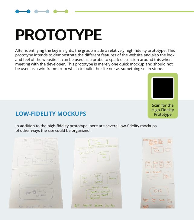
The phase produced a high-fidelity prototype of the core functionality, several low-fidelity mockups exploring other directions, and a tiered set of feature recommendations, all handed to the client’s web development team. The research settled a few questions early: grade-level organization should be the primary way into the content, search needed to be far stronger than anyone first expected, and local and regional connections to the historical material were what would set the site apart from national resources.
Key Takeaway
Looking hard at what already works elsewhere is one of the cheapest forms of user research there is, and pairing it with co-design kept the team from simply copying the best-looking site. The combination produced a clearer set of priorities than either method would have on its own.
Deeper Context
The project had to hold together several needs at once: fitting alongside the tools teachers already use, making a large and deep collection navigable, aligning resources to state standards, and serving teachers across very different grade levels. Timeline and resources were limited, so the method choices had to be realistic about what a small team could do in an exploration phase.
The Journey
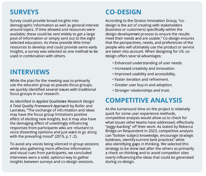
Before any design work, I evaluated which UX methods fit the goals, timeline, and resources, and settled on a sequence: 1) pre-planning to choose methods, 2) team kick-off sessions, 3) developing survey and interview questions, 4) exercises to surface our own design biases, and 5) several rounds of ideation. The bias exercises mattered more than I expected, since a team that already knows the collection well tends to design for people who already know it too.
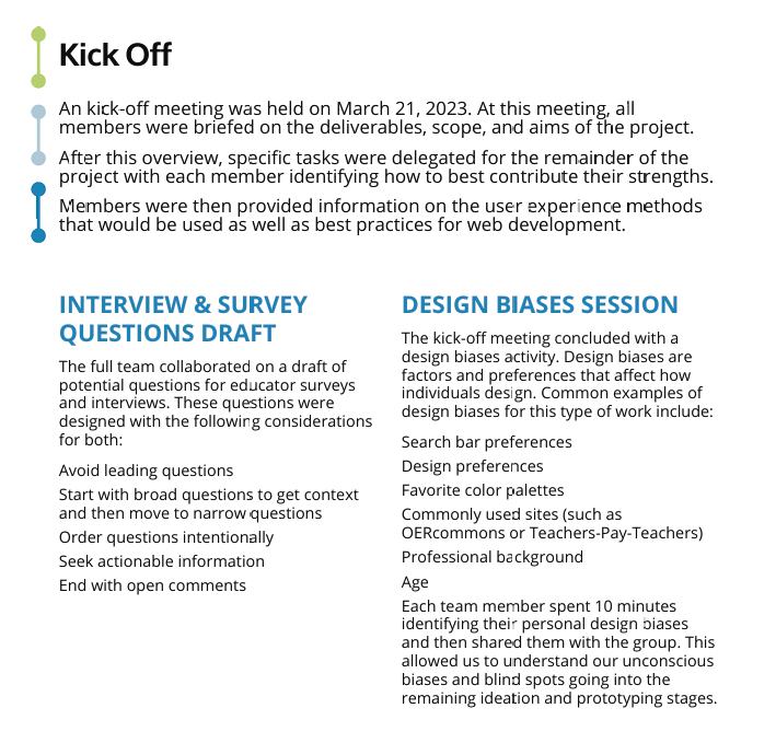
The competitive analysis covered 23 sites, and four stood out as models for particular problems. PBS LearningMedia was strongest on content organization and search, TeachItCT on local and regional connections, DocsTeach on document-based learning, and Teaching California on organizing by grade level. Teaching California’s grade-band structure in particular let teachers get to developmentally appropriate material quickly, and that shaped our recommendation for an organization system with chronological, thematic, and grade-level ways in.
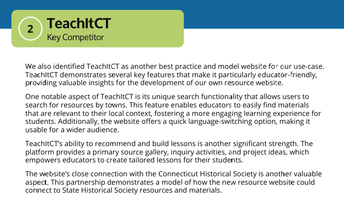
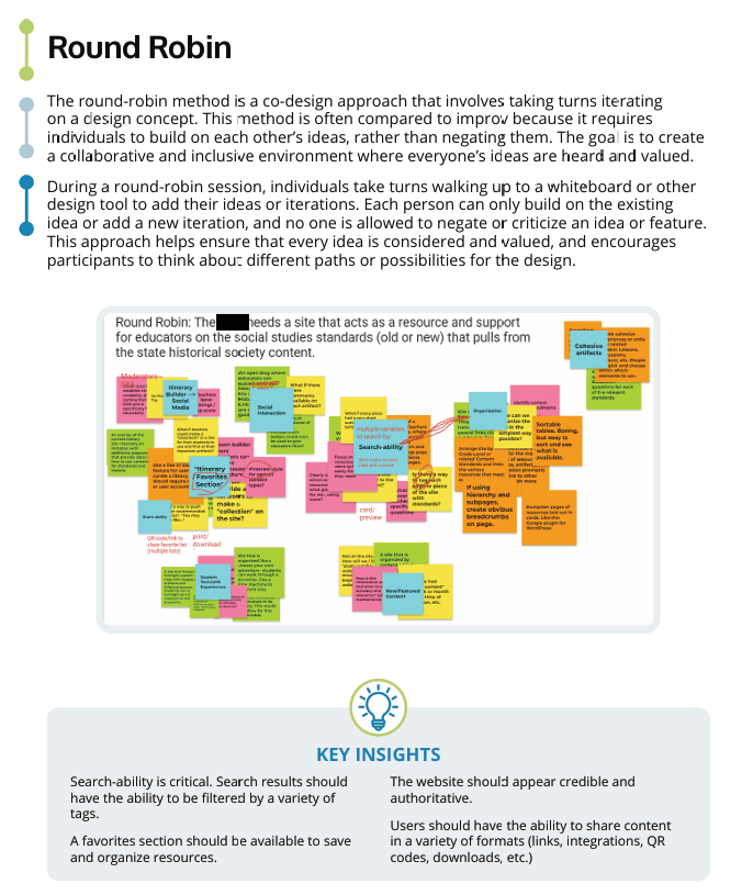
The three co-design methods each did different work. Round Robin had people build on each other’s ideas in turns rather than critique them, which produced most of our thinking on content organization.
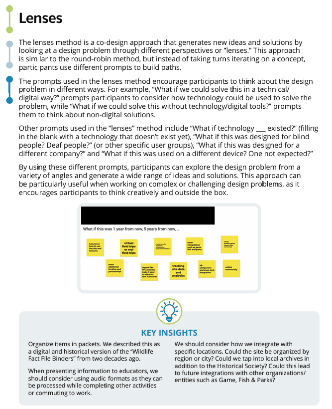
Lenses used prompts to look at the design problem from several perspectives and user scenarios at once.
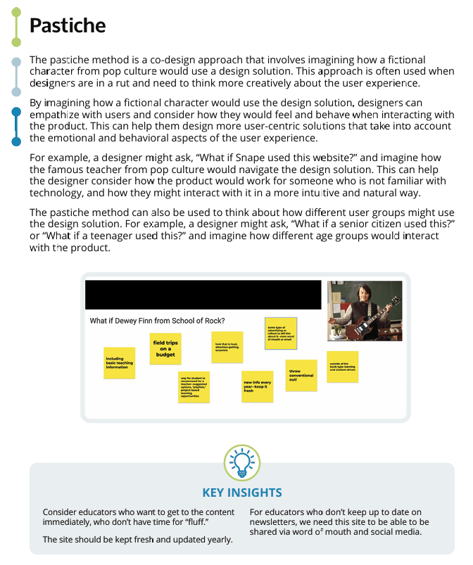
Pastiche asked us to imagine how different teacher personas would use the platform, which surfaced usability problems and differences in teaching style. It also produced one of the more useful observations of the project: teachers who don’t keep up with newsletters would only find the site if it traveled by word of mouth and social media. That led to recommending rotating featured resources and collections teachers could curate and share, instead of relying on announcements.
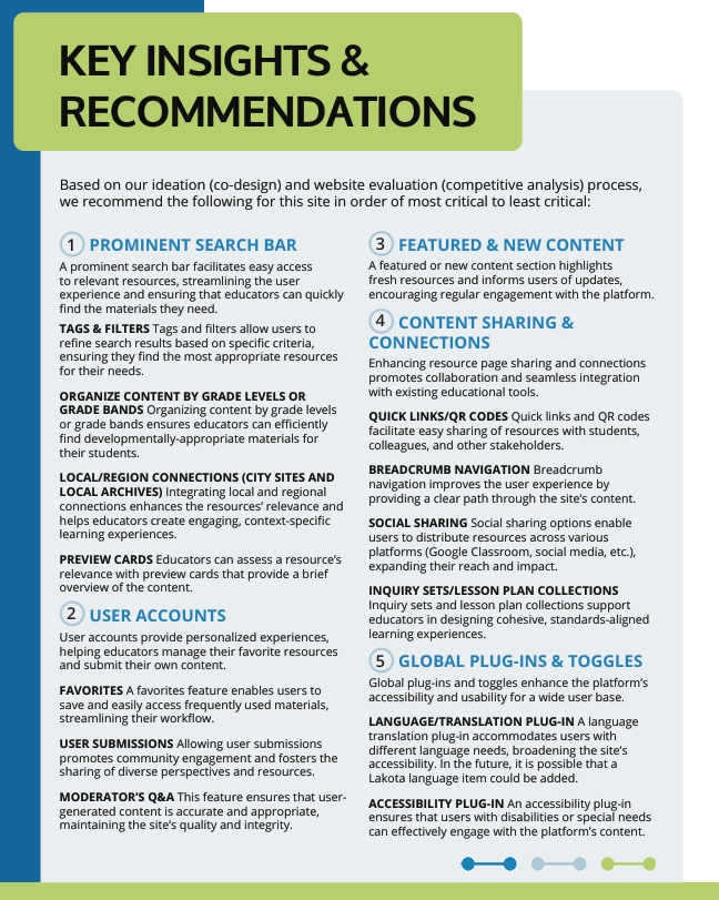
From there, the recommendations fell into three tiers. The primary features were search with strong filtering, grade-level organization, and local and regional content. The secondary features were user accounts, sharing tools, and featured content, with compatibility with common learning management systems as a thread through all of it. The tertiary tier held translation options, accessibility enhancements, and analytics.
The Work Itself
The tiered recommendations and a view of the prototype are below. Other artifacts from the report stay with the client.
What I’d Change
The tiering is the part I’d revisit first. Putting accessibility and translation in the tertiary tier treated them as enhancements to add later, and I’ve come to believe they belong in the foundation, built into the smallest components from the start, because retrofitting them rarely happens and is always harder. I’d also look harder at analytics before recommending it, and ask what the site actually needs to know about teachers and who else would end up with that data.
On process, the finding that search mattered more than anyone expected came fairly late. Getting the survey and interview questions in front of more working teachers earlier would likely have surfaced it sooner and given the co-design sessions firmer ground to stand on.
Connections
For more on designing resources for the connections teachers actually have, see Low-Bandwidth Course Design. For why I now push for fewer features rather than more, see The Hidden Cost of EdTech Complexity. If you’re working on a similar resource site, you can reach me at licht.education@gmail.com, and there are more tools, articles, and resources at bradylicht.com.

